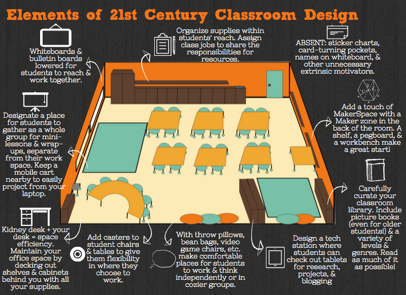
Classroom design is one of the most important things in teaching. Unfortunately, many educators don't really consider it enough. The most many schools concentrate on is wall displays and maybe table layout. However, there is so much more that can be considered when designing a learning environment. Lighting, space and colours are just a few things that can have a huge impact, but what else is there and how much of an impact can it make?
Does Classroom Design Affect Learning?
That's probably the first question that should be asked, and there is evidece that the answer is 'Yes!'.
"In a pilot study by the University of Salford and architects, Nightingale Associates, it was found that the classroom environment can affect a child’s academic progress over a year by as much as 25%."
The study looked at different design parameters like classroom orientation, light, colour and noise, temperature and air quality as well as flexibility of space, storage and organisation. Further research about the study can be found at the University of Salford Website.
A related follow up study by the same researchers found that
seven key design parameters have been identified that together explain 16% of the variation in pupils' academic progress achieved. These are Light, Temperature, Air Quality, Ownership, Flexibility, Complexity and Colour.
What about computers? Where do they come in?
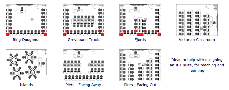
Computer rooms in schools are one of the very few rooms where there is flexibility in the design (DT rooms, and art rooms are also included). These would have been among the first that stretched from the more traditional designs and School leaders would have had to think of the most appropriate designs to try and fit 30 or so computers in a learning environment to promote productivity. There are various configurations available like those below:
Many schools would have used the Victorian or Piers -Facing away configuration, whereas, in my opinion, the Ring Doughnut with working desks in the centre is the best configuration (if you have the space). This allows the teacher to see all the computers (so he/she can keep an eye on them), but allows space for students to move away from the computers to do group work, book work or whatever they need to without computers. It also allows the room to be used by teachers that don't want to use computers at all, allowing the room to be most versitile. Click the picture for more details on each configuration.
Bringing the Future Even Closer
Research suggests, however, that there is much more to classroom design than just how the computers are distributed and ideally, every room could be designed with the same rules, regardless of subject being taught with the use of chromebooks, tablets or laptops instead of fixed computers. This would render the above fixed configurations less rigid. Further explanation can be found in the following video:
This will only catch on if teachers and educational leaders are behind the ideas of 21st Century Classroom Layouts and Design, and understand the benefits of more flexible learning environments. This is why the study being conducted by the University of Melbourne, is so important. There are other studies and articles that have been written that support 21st Century learning environments such as Thomas Murray's 3 Keys to Designing Learner-Centered Spaces, Edutopia's Visualizing 21st-Century Classroom Design (also source of main article picture) and EdSurge's Why the 21st Century Classroom May Remind You of Starbucks.
These ideas need to be spread further afield, and I feel it is central to fully utilising transformative eduational technology. In fact 21st century classroom design is educational technology, alongside the hardware inside the classrooms and the software that is used. My hope is more people realise this and our classrooms are transfomed.
More Research:
If you want to check out more about 21st century classroom design, have a loook at the links below
